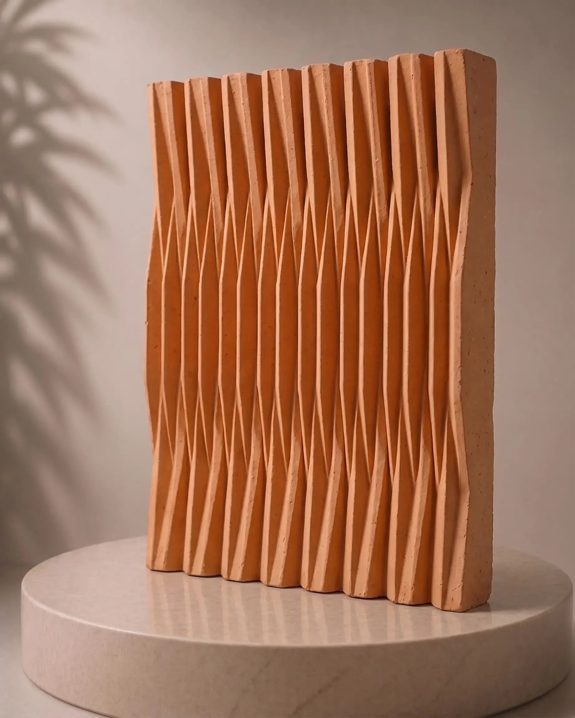
Surface materials are some of the hardest products to sell on a screen. A façade finish is judged on texture, colour shift in changing light and how it reads from across the street, and a phone display flattens all three. Good cladding product photography, careful CGI and a fast sample service are how brands close that gap.
This is a practical guide to showing materials online in a way that architects and designers can actually use. The principles apply whether you sell terracotta cladding, timber-look panels or flexible tiles.
Why texture is so hard to sell on a screen
On a building, texture is revealed by light. Low morning sun picks out every ridge in a fluted panel; midday light flattens it. Viewers also see the material at very different distances, from a street view where only colour and pattern register, to arm's length where grain and edges matter.
A single hero photograph captures one light, one angle and one distance. That is why so many product pages feel attractive but unhelpful. The specifier still cannot answer the questions they care about: what does it look like on a dull day, how visible are the joints, and how does it age?
The three scales every product needs
Plan imagery around the distances people actually experience a building from.
| Scale | What it answers | How to shoot it |
|---|---|---|
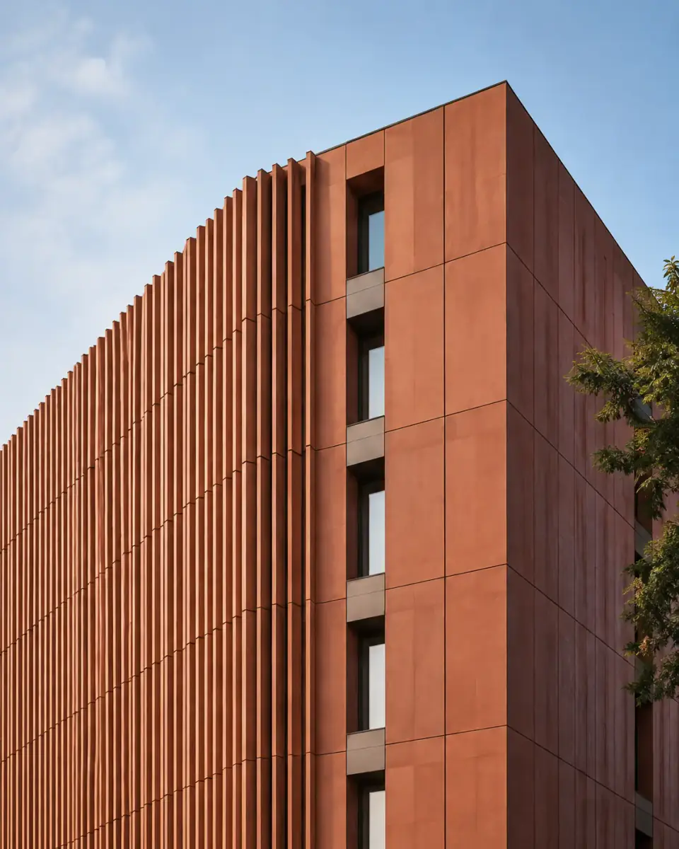
| Elevation | Colour, pattern and proportion at building scale | Wide, level view; include sky, roof and windows for context |
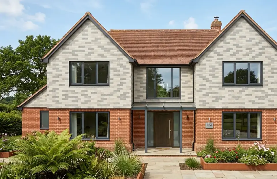
| Human detail | Joints, corners, reveals, how it meets doors and glazing | Eye-level shots around entrances and edges |
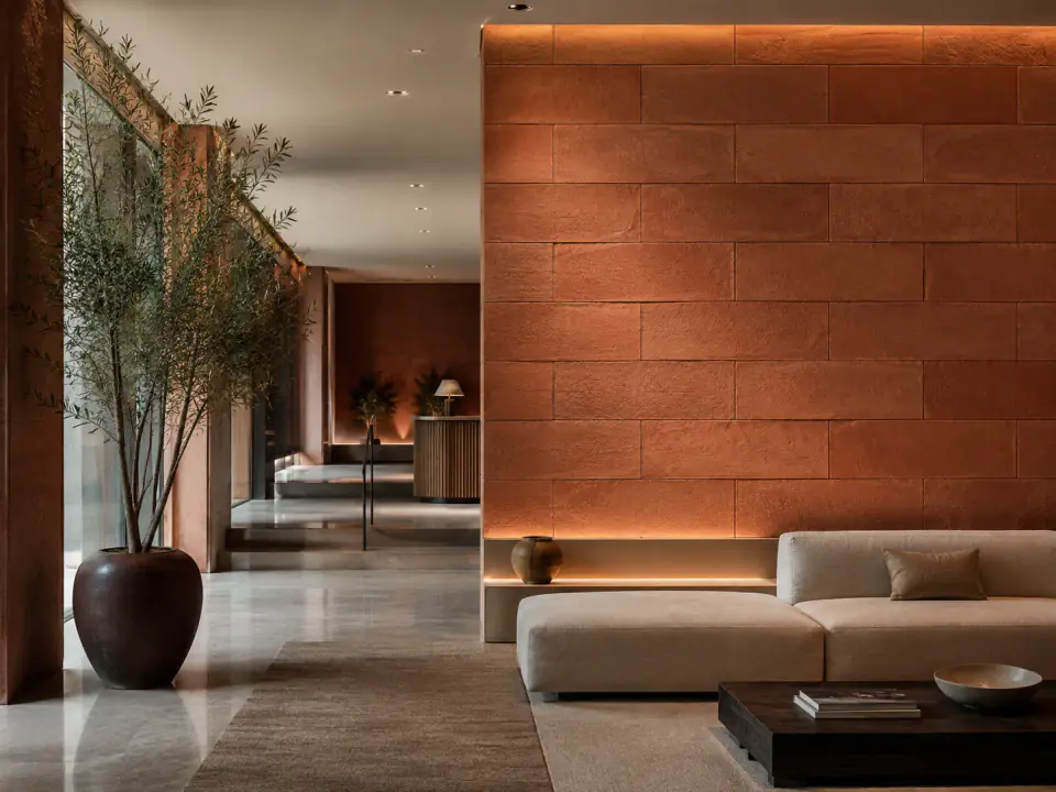
| Close texture | Surface relief, grain, sheen and edge finish | Raking light, square to the surface, repeated for every finish |
The middle scale is the one most often missing, and it is where architects look hardest. Corners, window reveals and junctions with other materials are where a façade succeeds or fails.
Building a repeatable studio setup
Finish photography only works as a catalogue if every image is directly comparable. That means the same background, plinth, lens, distance and lighting for every finish, shot in one session where possible.
A simple setup that works well:
- A neutral, matte backdrop that does not cast colour onto the sample.
- One main light at a low angle to reveal relief, plus soft fill to keep shadows readable.
- A fixed camera position and focal length, marked on the floor.
- A colour reference card in a test frame at the start of each session, so colour can be corrected consistently.
- The same crop and file naming for every finish, using the product code.
You can see the effect in Billi's finish images, where each sample sits on the same plinth in the same light. Comparing Flex03, Flex05 and Flex21 on the Flexible Tiles page is a judgement about the material, not about the photography.
Where CGI helps and where it hurts
CGI has become a practical tool for building product brands. It can place a finish on house types you have not photographed, show a full range on one consistent building, and illustrate details that are hard to capture on site.
It can also quietly erode trust when it is too perfect. Specifiers have seen enough flawless renders to be sceptical of them. A few rules keep CGI on the right side of that line:
- Use real, scanned or carefully matched textures, never a generic library material with your name on it.
- Keep lighting believable: overcast UK skies as well as golden hour.
- Label renders as visualisations wherever they sit next to real project photography.
- Never use CGI to imply a project exists that does not.
In our studio work, the most effective approach pairs a smaller set of genuine project photographs with consistent renders for range coverage. Visitors get proof and breadth at the same time.
Common mistakes that cost specifications
The same handful of problems appear again and again on materials websites. Each one makes a specifier work harder, and many simply move on to the next brand.
- Only showing hero shots. Beautiful wide images with no detail views leave the most important questions unanswered.
- Inconsistent finish photography. Different backgrounds, angles or light make a range impossible to compare.
- Colour that drifts between pages. Uncorrected images can make one finish look like two, or two look identical.
- No sense of scale. A close-up without a reference, such as a joint, a hand or a known module size, hides how large the pattern really is.
- Renders presented as projects. When a specifier spots this, they start doubting everything else on the site.
- Out-of-date imagery. Discontinued finishes still on the page lead to awkward conversations and wasted samples.
Fixing these rarely needs a new shoot for the whole range. A consistent studio setup and a short shot list for each product will lift a catalogue quickly.
The sample is the conversion
However good the imagery, almost no façade material is specified without a physical sample. The sample lets the architect check colour in daylight, test it against brick, glazing and roofing on the material board, and show the client something real.
That makes the sample request the most important conversion on a building product website, and it deserves the same design attention as the homepage. The best flows share a few traits:
- A clear "request a sample" action on every product and finish.
- The product pre-selected, so nobody types what they were just viewing.
- Only the fields needed to post it and follow up.
- A prompt reply confirming what is being sent.
If you work with a digital partner on this, ask them to treat photography, CGI, product data and the sample journey as one system rather than four separate jobs. That integrated way of building brand and web experience is central to how we work at House of Origo, and it is what lets a materials range feel as considered online as it does in the hand.
Bringing it together
A product page that sells a surface well usually contains:
- An elevation image that shows the finish at building scale.
- Two or three human-scale details around openings and corners.
- Consistent close-ups of every finish, named by code.
- A short, honest description of where the product works best.
- A one-click route to samples and to a person who can answer questions.
That is the standard Billi aims for across its range. Explore the finishes on Terracotta Claddings, read our guide to choosing cladding colour and texture, then request samples to see them in your own light.
Frequently asked questions
Should cladding brands use CGI or real photography?
Both, for different jobs. Real photography of installed projects proves the product works in the real world and builds trust. CGI is useful for showing finishes on building types you have not photographed yet, or for consistent comparisons across a range. Label renders clearly so specifiers know what they are looking at.
How do you photograph texture on cladding?
Use low, raking light from one side so the surface relief casts small shadows, keep the camera square to the surface for colour shots, and shoot every finish under the same setup. Add a close-up, a human-scale detail and a whole-elevation view so the texture can be judged at each distance.
Why do online colours look different from real samples?
Screens vary in brightness and colour calibration, and daylight changes through the day. Photos can only approximate a finish. That is why physical samples, viewed outdoors in daylight and beside the other materials in the scheme, remain the reliable way to choose a colour.