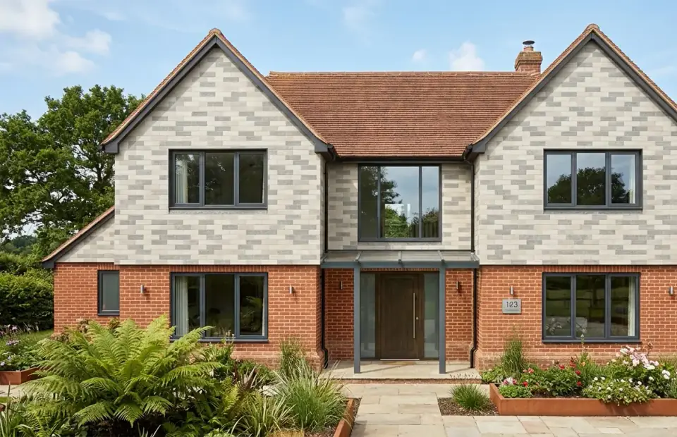
Choosing cladding colours is less about picking a shade from a chart and more about understanding how a surface will behave in a particular place, under particular light, over many years. The same finish can look warm and rich on a south-facing elevation and flat and cool on a north one. Texture changes the picture again, because it controls how much shadow a wall holds. This guide sets out a practical method for choosing colour and texture with confidence, inside and out.
Start with context, not the sample board
The best exterior colour schemes respond to their surroundings. Before shortlisting any finish, walk around the site and note the colours of roofs, neighbouring walls, boundary walls, paving and planting. In many parts of the UK there is a clear local palette, such as red and buff brick, pale limestone, grey slate or dark timber, and a finish that relates to it usually sits more comfortably.
Relating to context does not mean copying it. A warm clay tone can complement red brick without matching it, and a textured stone finish can echo local stone walls in a contemporary way. Note too that a change of appearance can affect planning: under permitted development in England, cladding a house generally needs materials of similar appearance to the existing ones, so check our guide to cladding and planning permission in England if you are moving away from the existing look.
How light and orientation change colour
Daylight in the UK is often soft and grey, which mutes saturated colours and flattens subtle ones. Direct low winter sun has the opposite effect, warming reds and ochres and throwing texture into relief.
- North-facing elevations receive little direct sun. Colours read cooler and darker, so a slightly warmer or lighter finish than you first expect often works better.
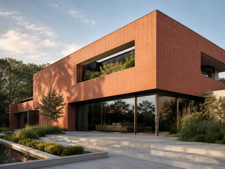
- South-facing elevations get strong, changing light. Warm clay and terracotta tones glow, while very dark finishes absorb more heat.
- East and west elevations change dramatically through the day, so view samples in both morning and evening light.
Large areas also read lighter and more saturated than a small sample suggests. If you are between two shades on a sample, the quieter option is often the one that looks right at full scale.
Texture: scale, shadow and distance
Texture is as important as colour. A deeply textured surface holds shadow in its recesses and will read darker and richer than a smooth finish in the same base colour. It also hides minor dirt and weathering marks better.
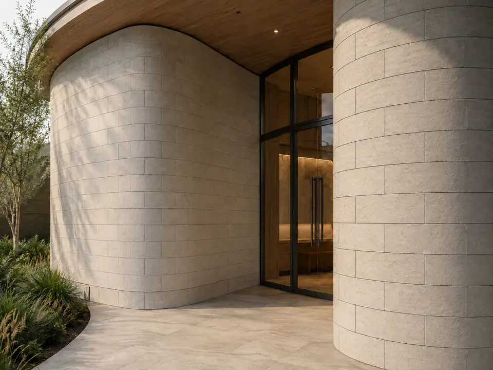
Viewing distance decides how much texture you need. Fine detail disappears at the scale of a whole elevation seen from the street, so large walls often benefit from a pronounced texture or a clear joint pattern. At an entrance, a reception wall or an interior feature, people stand close, so finer textures and subtle variation become visible and valued.
Some cladding texture ideas worth considering:
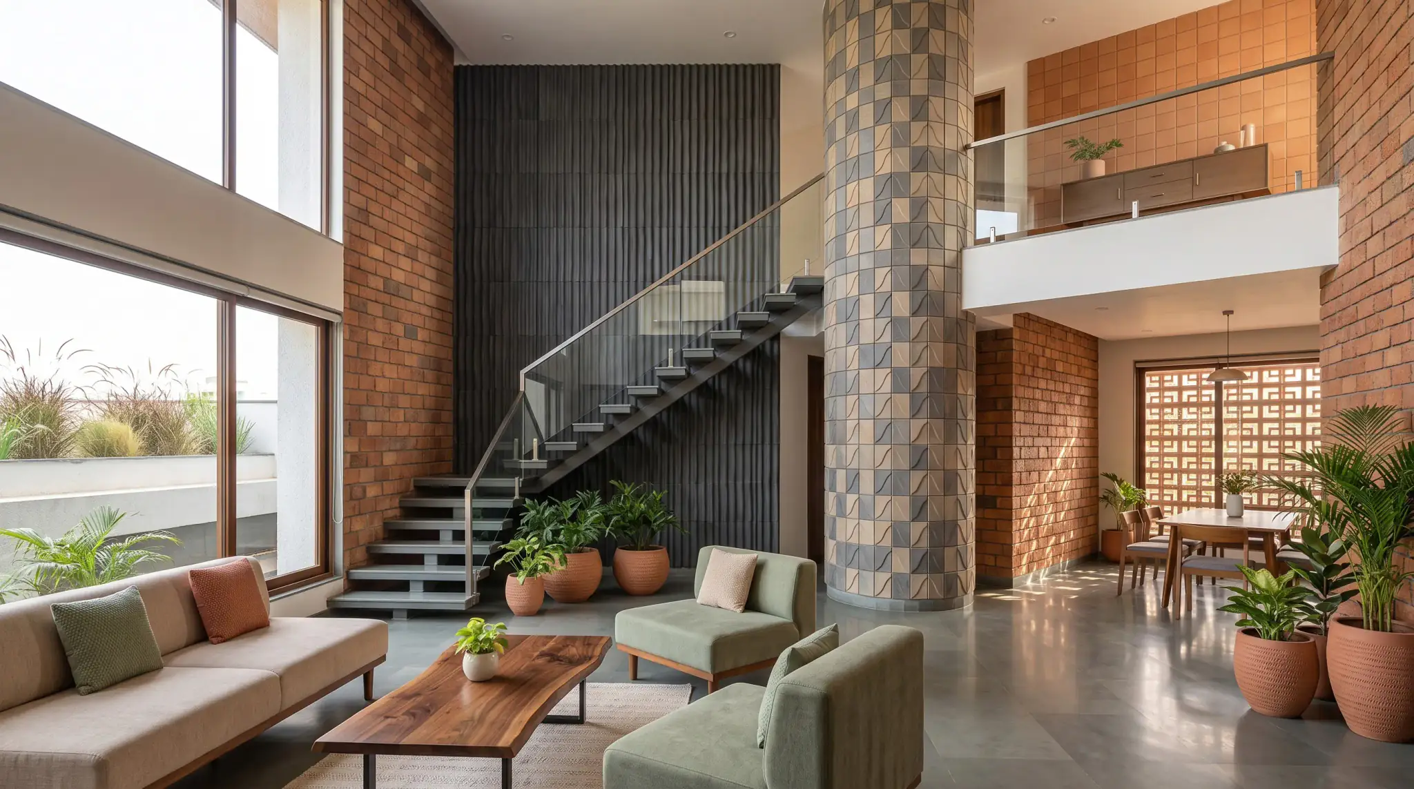
- Clay-like and brick-effect textures for warmth and familiarity. Billi's flexible tiles bring clay-like surface character in thin formats that also suit interior walls and feature areas.
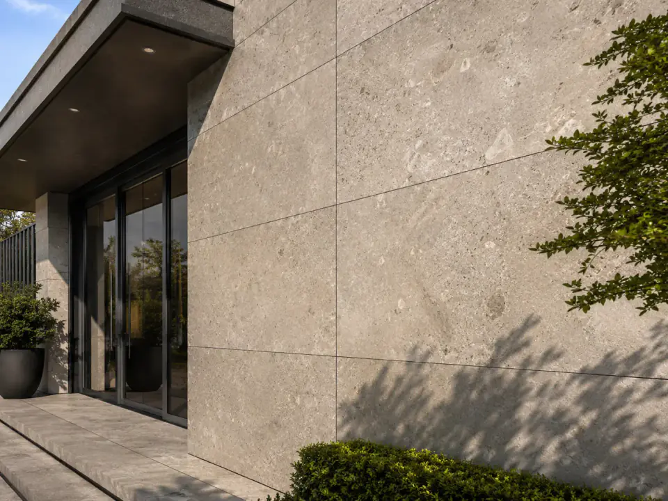
- Natural stone for depth and a sense of permanence. Stone claddings work well on plinths, entrances and interior features.
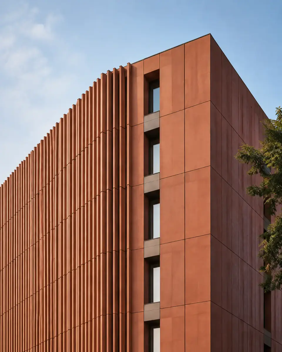
- Smooth or finely textured clay for crisp contemporary elevations, as found in terracotta claddings.
- Fluted or ribbed profiles to catch light and add vertical rhythm, particularly on interior feature walls.
Plan for how the finish will age
Every exterior surface changes. Rain run-off, dust, algae in shaded areas and sunlight all affect how a façade looks over time. When choosing, ask how the specific finish weathers, whether its colour is through the body or on the surface, and what the manufacturer recommends for cleaning.
Very pale finishes show streaking under sills and copings more readily. Very dark finishes can show dust and salt marks. Mid tones with some natural variation tend to be the most forgiving, especially on elevations that are hard to reach for cleaning. Good detailing, such as drips and projecting sills, matters as much as the colour itself. Our guide to cleaning and maintaining cladding covers care in more detail.
Pairing cladding with windows, roofs and trims
Cladding colours rarely stand alone. Window frames, roof coverings, rainwater goods, fascias and doors all form part of the scheme.
| Cladding tone | Window and trim pairings that often work | Roof pairings that often work |
|---|---|---|
| Warm terracotta and clay reds | Anthracite, bronze or black frames | Dark grey slate or tile, standing seam metal |
| Buff, sand and pale clay | Bronze, soft grey or dark green frames | Warm grey or red clay tile |
| Mid and dark grey stone | Black, white or natural timber frames | Slate, zinc or dark metal |
| Charcoal and near-black | Black frames for a monolithic look, timber for warmth | Matching dark metal or slate |
| Mixed natural stone | Neutral, recessive frames | Simple slate or tile that does not compete |
Limit the palette. Two main materials plus one accent is usually enough for a house; more than that tends to look busy. Keep rainwater goods and trims recessive unless they are a deliberate part of the design.
How to test cladding samples properly
- Shortlist. Narrow the choice to two or three finishes based on context and the design intent.
- Order real samples. Screens and printed brochures cannot show colour or texture reliably.
- View them outdoors. Hold samples vertically against the actual wall, not flat on a table indoors.
- Check every elevation. Look at them on the sunniest and the shadiest sides of the building.
- Repeat at different times. View in morning, midday and evening light, and on an overcast day.
- Step back. Look from the street or garden as well as up close.
- Test the pairings. Place samples next to window frame colours, roof tiles and paving.
- Consider a mock-up. On larger projects, a small sample panel on site shows joints and texture at real scale.
Common colour and texture mistakes
- Choosing indoors under artificial light. It distorts both colour and texture.
- Matching too closely. A near match to existing brick can look like a mistake; a clear, considered contrast often looks better.
- Ignoring joints. Joint colour and width change the overall tone of a wall, especially with smaller units.
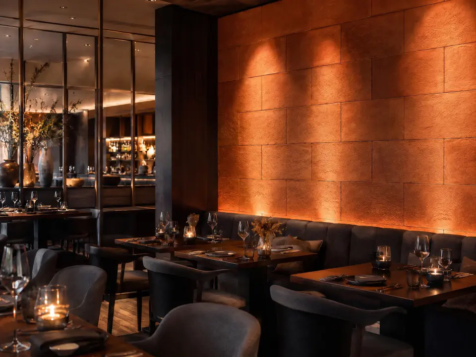
- Forgetting interiors. Indoors, artificial lighting and grazing light reveal texture strongly, so test samples under the actual lighting scheme.
See the finishes in person
Billi offers a wide choice of colours, textures and finishes across its Modified Clay Material ranges, for interior walls, exterior façades and feature areas. The only reliable way to choose is with physical samples on site. Request samples for your shortlist, or talk to the team about the context and light your project has to work with.
Frequently asked questions
How do I choose a cladding colour for my house?
Start with the setting: the roof, neighbouring buildings, local materials and landscape. Shortlist two or three cladding colours, then view large samples outdoors on each elevation at different times of day. Check how the colour works with your window frames and roof, and think about how it will look as it weathers rather than only on day one.
Do dark cladding colours fade or get hot?
Dark surfaces absorb more sunlight than light ones, so they can run warmer and may show fading or weathering differently depending on the material and pigments. Ask the manufacturer how the specific finish performs on south and west elevations, and check whether the fixing system and substrate need any allowance for extra movement on sun-facing walls.
What cladding texture works best on a modern house?
It depends on scale and viewing distance. Smooth or finely textured finishes give crisp, minimal elevations, while deeper textures add shadow and interest on large plain walls. Many modern houses combine one main texture with a contrasting accent at the entrance or plinth. Look at samples from the distance people will actually see the façade.